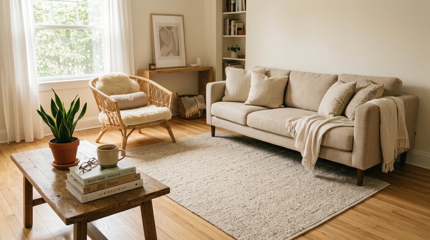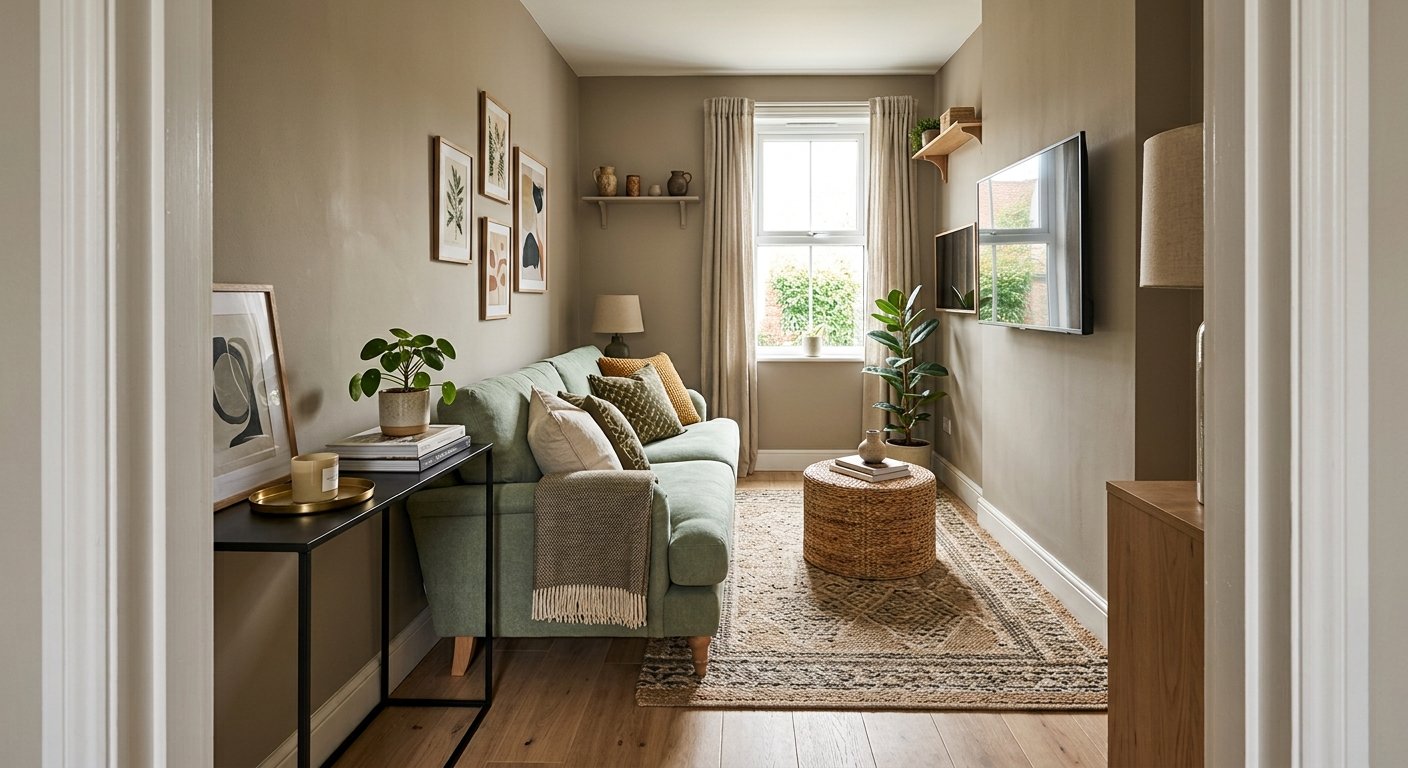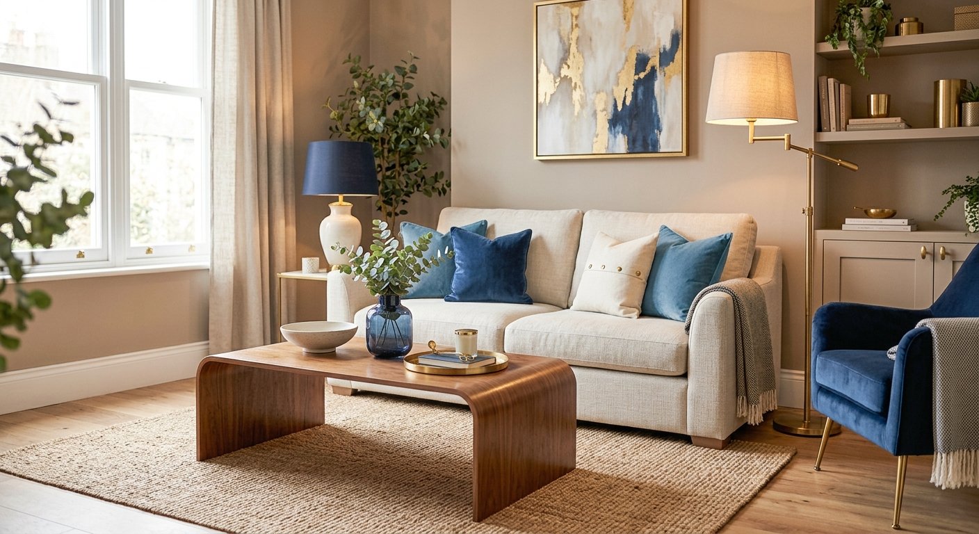
You want your living room to feel elevated, chic, the kind of space people notice when they walk in, without spending thousands to get there.
Here's the secret most people miss: true luxury was never about square footage. It's about detail, restraint, and knowing exactly where to spend versus where to save.
This guide breaks down the actual designer hacks that create small living room luxury on a budget, no major renovation or blown budget required.
In This Article
The Core Elements of Affordable Small-Space Luxury
14 High-End Design Hacks for a Budget Living Room Makeover
Lighting & Detail Hacks
Wall, Ceiling & Art Hacks
Furniture, Hardware & Material Hacks
Styling & Display Hacks
FAQ
The Core Elements of Affordable Small-Space Luxury
Before you touch a single product, it helps to understand the three underlying principles designers actually rely on. Every hack later in this guide is just one of these three ideas applied to a specific object or wall.
Color Palette Magic: Moving Beyond Flat White to Warm Neutrals
Builder-grade white walls are the single biggest giveaway of an unstyled rental or starter apartment. It's not that white is wrong; it's that flat, cool-toned white reads as unfinished rather than intentional.
Warm neutrals- think soft taupe, bone, and clay- do something flat white can't: they add depth and dimension to a wall without adding visual clutter or shrinking the room.
The easiest entry point here is a warm white or taupe paint on the walls, paired with one deeper clay or terracotta accent somewhere in the room: a pillow, a vase, a piece of art.
You don't need to repaint every wall to get this effect. A single accent wall in a soft clay tone, or even just swapping your existing white trim and moldings for a warm bone shade, shifts the entire room's perceived quality.
Brands like Behr and Sherwin-Williams both have entire warm-neutral lines built specifically around this look, and a gallon of paint is one of the cheapest upgrades on this entire list relative to its visual impact.
If a full repaint isn't in the budget right now, or you're renting and can't paint at all, peel-and-stick wallpaper in a warm plaster or limewash finish is a realistic workaround that most landlords allow.
Focus the warm tone on whichever wall gets the most eye contact when someone first walks in, usually the wall directly opposite the entryway, since that's the surface doing the most work to set the room's first impression.
The Scale Trick: Why Oversized Decor Makes Small Rooms Look Bigger
This one feels backwards until you see it in person. Filling a small room with small decor, tiny frames, small lamps, a small mirror, actually makes the room look busier and smaller, because your eye has to work harder processing more individual objects.
One or two intentionally oversized pieces- a large mirror, a substantial floor lamp, a single big piece of art- give the eye fewer things to focus on and read as confident, designed choices rather than accidental clutter.
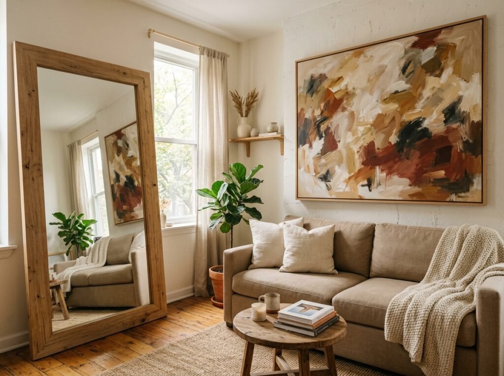
The rule of thumb designers use is to pick one or two "hero" pieces per room and size them up, while keeping everything else around them simple and restrained. A large leaning mirror against a wall, for instance, does more for a small living room than five small wall-mounted ones ever could, both because it reflects more light and because it reads as a deliberate design statement rather than an afterthought.
The same logic applies to art and lampshades, two places where people instinctively size down in a small room when they should do the opposite. One large-scale piece of art above the sofa, ideally at least two-thirds the width of the sofa itself, anchors the wall far better than a cluster of small frames.
Oversized lampshades work the same way: a wider drum shade on a floor lamp casts warmer, more diffused light and simply looks more substantial than the narrow, tapered shades that tend to ship with budget lamp sets.
Material Honesty: Mixing Textures for a Layered Custom Look
A room built entirely from one material- all smooth fabric, all matte black metal, all glossy surfaces- tends to feel flat no matter how expensive any individual piece is.
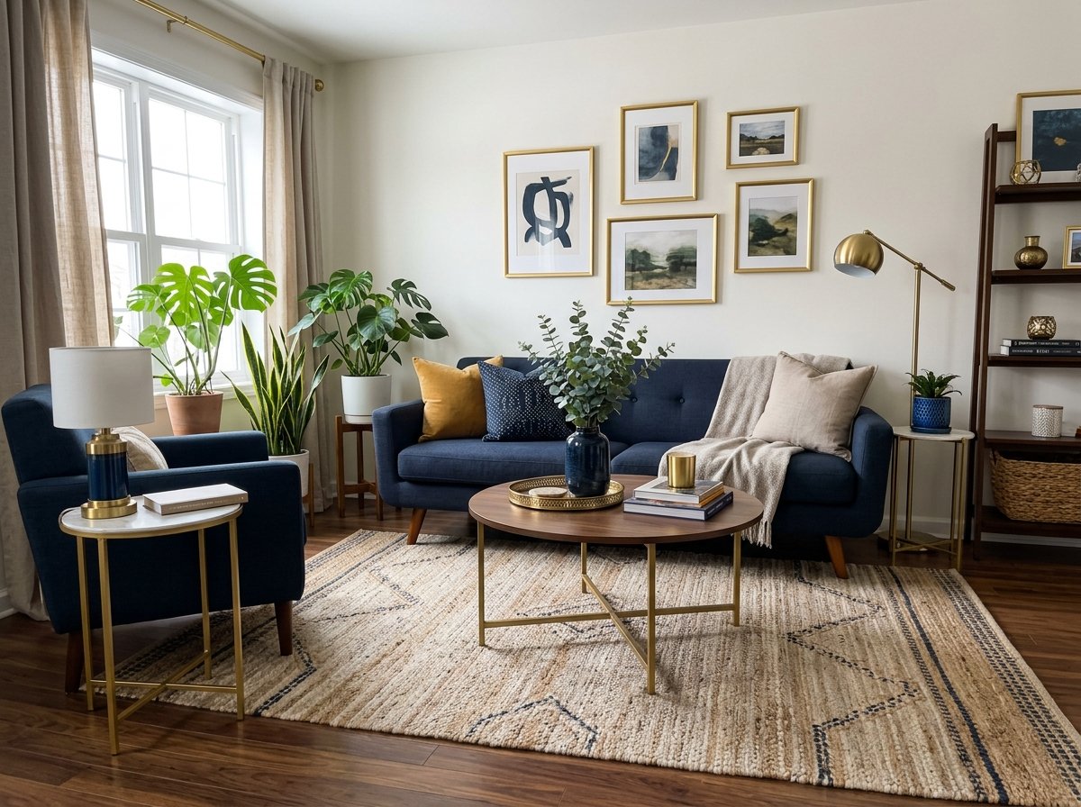
Real luxury comes from mixing textures within a cohesive palette. Woven wood elements like a rattan chair or a jute rug, warm metal accents in brass or bronze, and soft linen or bouclé upholstery all working together create the kind of layered, custom look you'd expect from a professionally designed space.
You don't need to source rare materials to pull this off. A single woven pendant light, one set of brass drawer pulls, and a linen throw pillow can be enough to introduce all three textures into an otherwise plain room.
The goal isn't maximalism; it's variety within restraint: two or three material types repeated intentionally throughout the space rather than one flat texture covering everything.
14 High-End Design Hacks for a Budget Living Room Makeover
With the core principles in place, here are fourteen specific, actionable upgrades, grouped by category so you can tackle whichever area of the room you're focused on first.
One note before you dive in: if your furniture itself is still fighting your floor plan, no amount of styling fixes a layout that doesn't work. It's worth sorting out a layout that actually fits your space first, then coming back to these.
Lighting & Detail Hacks
Lighting and the small finishing details around it are often the fastest, cheapest way to change how a room feels.
1) Layered Accent Lighting
A single overhead ceiling light, especially the flat, builder-grade fixture most apartments come with, is the number one reason a room feels cheap rather than curated.
Designers rarely rely on one light source. Instead, layer in at least two additional sources: a floor lamp near your seating, a table lamp on a console or side table, and if your budget allows, a plug-in wall sconce. Warm-toned bulbs, around 2700K, make a bigger difference here than the fixture itself, since cool white light flattens a room and warm light adds the cozy, expensive-feeling glow associated with high-end interiors.
IKEA and Target both carry affordable plug-in sconces that require no electrical work, just a nearby outlet and a piece of cord-concealing channel, which brings us to the next hack.
Dimmers are worth the small extra cost if your existing lamps and fixtures support them, since the ability to lower the overall brightness in the evening is one more layer separating a designed room from a purely functional one.
If rewiring or hardwired dimmers aren't an option in a rental, plug-in dimmer switches that sit between the lamp and the outlet accomplish the same thing for a fraction of the cost and effort.
2) Concealing Cord Clutter
Visible cords are one of the fastest ways to mess up an otherwise polished room. A $10 to $15 paintable cable channel, sold at most hardware stores and on Amazon, lets you run a lamp or sconce cord flush along the wall or baseboard and paint it to match, making it essentially invisible.
This is a five-minute fix that has an outsized effect on how finished a room looks, especially once you've added the extra lighting layers from Hack 1, since more lamps means more cords to manage.
3) Angling a Mirror to Double Your Natural Light
This is different from the mirror advice in the Scale Trick section earlier, which is about size. This one is about placement. A mirror hung directly across from or at a slight angle to your best window bounces daylight back into the room instead of just reflecting a blank wall or the back of your sofa.
Before you hang anything, stand where the mirror will go and check what it will actually reflect, since a mirror facing the wrong direction adds nothing but a frame on the wall.
The sweet spot is usually the wall perpendicular to the window, angled just enough to catch the light without reflecting the window's glare directly at your seating.
Our Recommendation
Layered lighting, hidden cords, and smart mirror placement are the fastest fixes for making a small room feel elevated. These three picks solve every lighting frustration without renovation.
Wall, Ceiling & Art Hacks
These hacks use your walls and ceiling height, two things every room has, to create the illusion of a larger, more architecturally interesting space.
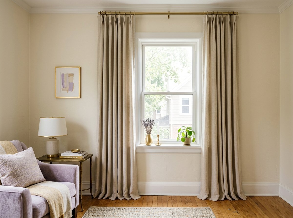
4) Floor-to-Ceiling Drapery
One of the most reliable designer tricks for a small room is hanging curtain rods as close to the ceiling as possible, well above the actual window frame, and choosing curtains long enough to just skim the floor.
This draws the eye upward and makes ceilings look taller than they actually are, an illusion that instantly elevates a room regardless of its real square footage.
Budget-friendly linen-look curtain panels from IKEA or Target work fine here. The rod placement and curtain length are doing almost all of the actual work, not the price of the fabric.
5) Styling an Oversized Gallery Wall
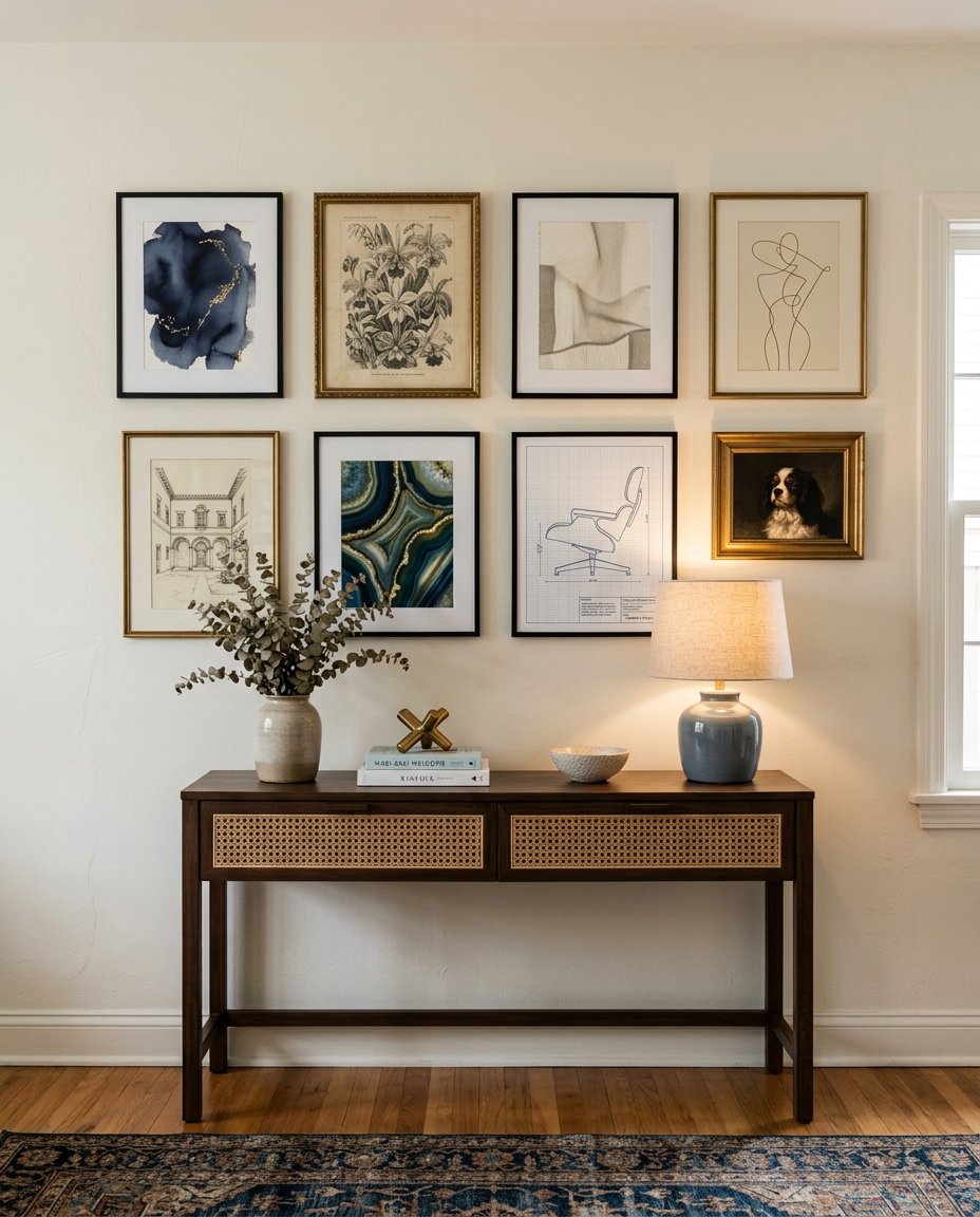
A gallery wall can look either high-end or chaotic depending entirely on one variable: frame consistency. Matching frames, even inexpensive ones, in a single color like black, brass, or natural wood create a cohesive, gallery-like effect.
Mismatched frames in random colors and finishes read as thrifted clutter instead. Stick to one frame finish, vary the artwork inside, and leave two to three inches of consistent spacing between each piece for a clean, intentional layout.
Before hanging anything, lay the full arrangement out on the floor first and photograph it from above. It's a lot easier to adjust spacing and balance on the ground than to keep re-patching nail holes once frames are already on the wall, and the overhead photo makes uneven gaps obvious in a way that's harder to spot standing directly in front of the wall itself.
6) The Thrifted Art & Modern Heritage Mix
Vintage and thrifted art pieces, mixed in with one or two modern prints, create a collected-over-time feeling that instantly reads as more expensive than an all-new, all-matching art set.
This is the "modern heritage" look many designers use, blending old and new intentionally rather than filling a wall with a single matching set from one store.
Estate sales, Facebook Marketplace, and thrift stores are the best low-cost sources here, and the mismatched frame from Hack 5's matching rule is actually the one place you want deliberate variety, since the art itself is where the personality lives.
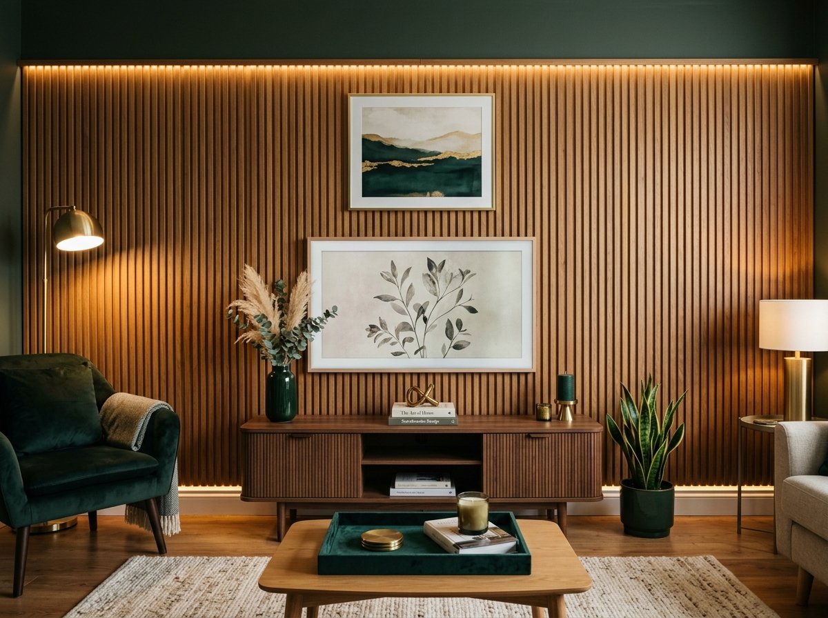
7) Adding Architectural Interest with Peel-and-Stick Fluted Panels
Fluted or reeded wall paneling used to require real carpentry and a real budget.
Peel-and-stick fluted panels, widely available on Amazon and at home improvement stores, let you add that same architectural texture to an accent wall or a TV wall. It adds depth to a room without any tools beyond a level and a utility knife.
This single hack does more to disguise a flat, builder-grade wall than almost anything else on this list, and it's fully renter-friendly since most versions remove cleanly.
8) Color Drenching Your Walls, Trim, and Ceiling
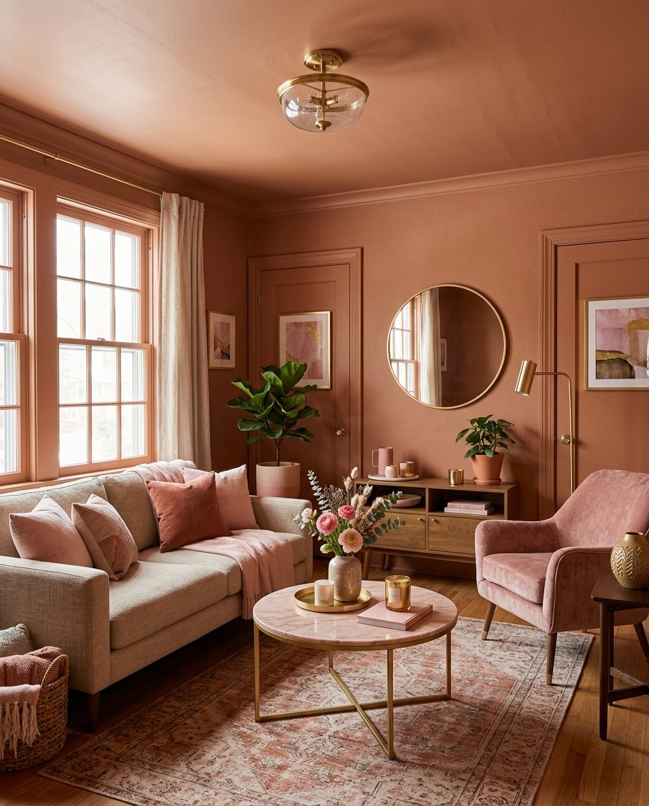
This is different from the Color Palette Magic principle covered earlier, which is about picking a warm tone. This hack is about applying that tone everywhere in the room- walls, trim, baseboards, and even the ceiling- in the same or a very close shade, instead of the standard white trim against a colored wall.
Stark white trim creates a hard visual cutoff that makes a small room look boxier and more chopped up. Removing that contrast lets the walls and ceiling read as one continuous, flowing surface, which is a technique borrowed directly from high-end designer portfolios and one of the fastest ways to make a small room feel cohesive rather than assembled piece by piece.
Most major paint brands will color-match trim paint to your wall color if you bring in a sample, so this doesn't require anything beyond the warm-neutral wall color you already picked from the Color Palette Magic section earlier.
Our Recommendation
Floor-to-ceiling curtains and textured walls create the illusion of height and sophistication. These picks handle the architectural upgrades that make small rooms feel designed.
Furniture, Hardware & Material Hacks
These three hacks focus on the physical pieces in the room and the small material choices that separate a high-end look from a big-box one.
9) Swapping Hardware for Aged Bronze and Unlacquered Brass
If your media console, side tables, or any cabinetry came with plain builder-grade knobs, swapping them for aged bronze or unlacquered brass pulls is one of the cheapest upgrades with the highest visual return.
Unlacquered brass in particular develops a natural patina over time, which is part of why designers favor it; it looks intentionally aged and collected rather than shiny and new.
A full hardware swap on a media console typically only requires a screwdriver and a handful of replacement pulls from Amazon or a hardware store.
10) Incorporating Curved & Sculptural Furniture Accents
A room full of only straight-edged, boxy furniture tends to feel rigid and mass-produced. Introducing even one curved piece- a rounded accent chair, an organic-shaped side table, a curved mirror- softens the whole space and reads as more considered.
You don't need to replace your whole furniture set to get this effect. One sculptural side table next to an otherwise straight-lined sofa is often enough to shift the entire room's feel.
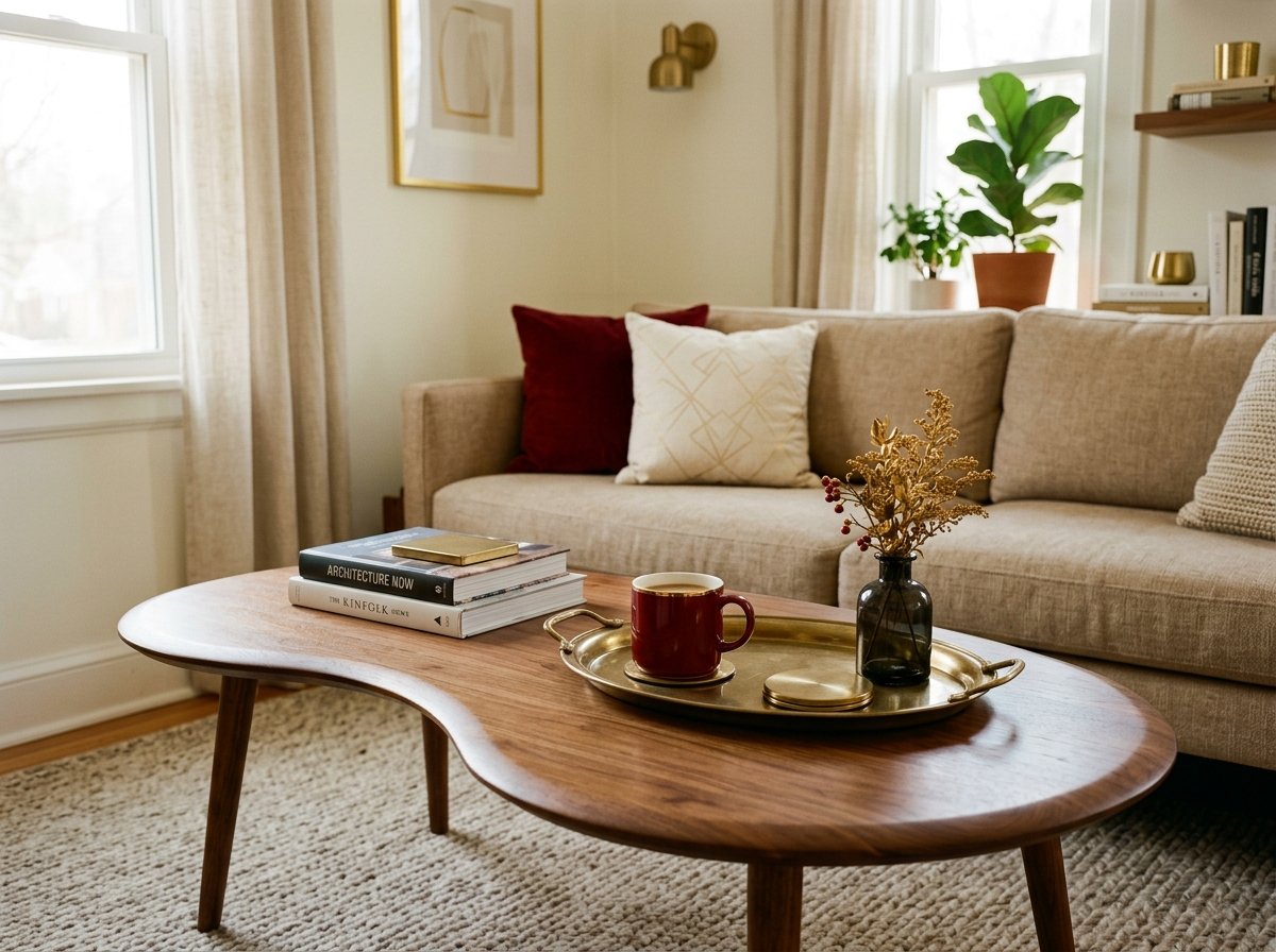
Coffee tables are usually the easiest place to introduce a curve without disrupting your existing layout, since swapping a rectangular table for a kidney-shaped or circular one doesn't require reworking your seating arrangement at all.
If your budget only stretches to one curved piece this round, prioritize whatever sits at the center of the room's main sightline, that's the object doing the most visual work every time someone sits down.
11) Upgrading Cushion Inserts to Down Alternative Fillers
This is the hack almost nobody thinks of, and it's one of the most noticeable in person. Standard foam cushion inserts, the kind that come with most budget sofas, look flat and slightly deflated no matter how nice the cushion cover is.
Swapping them for down alternative inserts, widely available on Amazon for a fraction of what a new sofa would cost, gives your existing cushions that plush, slightly overstuffed look associated with higher-end furniture. It's a genuinely underrated upgrade for the price.
When sizing replacement inserts, go about 10 percent larger than your actual cushion cover dimensions rather than an exact match. That extra overstuff is what creates the rounded, plump silhouette high-end sofas are known for, while an exact-size insert tends to settle flat again within a few weeks of regular use.
12) Anchoring the Room with a Properly Sized Rug
Almost none of the hacks above matter if the rug underneath everything is too small or missing entirely.
An undersized rug is one of the fastest ways a room reads as unfinished, no matter how good the walls, lighting, and furniture are, since it makes the whole seating area look like it's floating disconnected from the floor.
Getting this right isn't about spending more; it's about sizing correctly, and it's specific enough to its own room dimensions and furniture layout that it's worth walking through properly rather than summarizing here.
Choosing the right rug size for a small living room covers exactly how to measure your space and pick the size that actually anchors your furniture instead of shrinking it.
Our Recommendation
Small details like hardware swaps, cushion upgrades, and rug sizing shift a room from "furnished" to "designed" instantly. These picks are the finishing moves that pull everything together.
Styling & Display Hacks
The final two hacks are about how you arrange what you already have, not what you buy.
13) Styling Bookshelves with Breathing Room and Organic Bowls
An overstuffed bookshelf, every shelf packed edge to edge, reads as cluttered no matter how nice the individual items are.
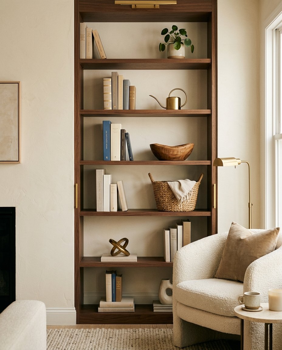
Designers style shelves with intentional negative space, leaving roughly 20 to 30 percent of each shelf visually empty, and grouping items in odd numbers; threes work particularly well, rather than lining everything up in a neat row.
Adding one or two organic material pieces, a wooden bowl, a stone object, a woven basket, alongside your books breaks up the flat lines of spines and adds the same textural variety discussed in the Material Honesty section earlier in this guide.
Varying height is just as important as the objects themselves. Stack a few books flat and set a small object on top rather than shelving every single book upright, since that horizontal break gives the eye a resting point and keeps the whole shelf from reading as one repetitive vertical rhythm.
Turning a handful of books spine-in, so only the pages show, is another trick worth trying if your book covers are a mix of colors that clash with your room's palette.
14) The Rule of Three for Coffee Table and Console Styling
The same odd-number grouping logic from Hack 13 applies to your coffee table and any console or entry table, but it's worth calling out on its own since these surfaces get styled completely differently from a shelf.
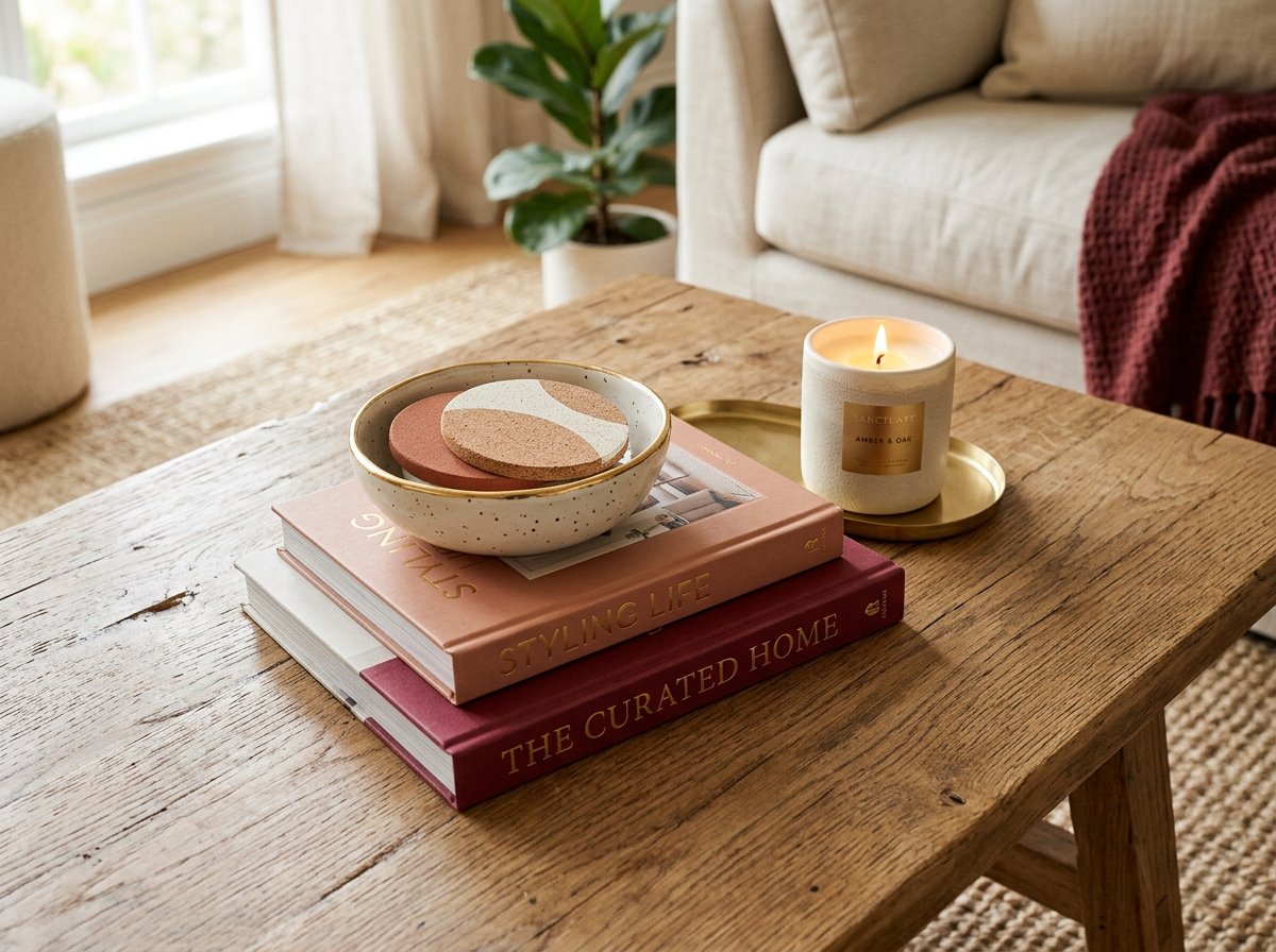
A coffee table works best with three objects of varying height and shape: something to stack, something to hold, something with a bit of life. A common combination is a stack of two or three books, a small tray or bowl holding remotes or coasters, and one organic object like a candle or small vase.
Skip lining all three up in a row. Cluster them with slight overlap instead, the way you'd naturally set things down rather than arrange them, since that's what actually reads as lived-in luxury instead of a staged showroom.
You already have most of what a high-end small living room needs, it's mostly a matter of adjusting light, texture, and scale rather than buying an entirely new room's worth of furniture.
Pick two or three hacks from this list that fit your current setup best, start there, and let the rest come together over time. Luxury was never about how much you spent. It's about how intentional every choice in the room feels.
Frequently Asked Questions (FAQ)
What makes a small room look expensive?
It comes down to a handful of repeatable choices: warm neutral tones instead of flat white, a few intentionally oversized pieces instead of many small ones, layered lighting instead of one overhead fixture, and mixed textures like brass, wood, and linen working together. None of these require a large space, which is exactly why they work so well in small rooms specifically.
How can I decorate my living room on a low budget?
Start with the changes that cost the least but affect the whole room: a warm-neutral paint refresh, swapping cabinet hardware, and adding one or two layered lamps. From there, work through the hacks in this guide roughly in order of cost, since things like peel-and-stick paneling and thrifted art deliver a big visual shift without requiring you to replace any existing furniture.
What colors make a small living room feel larger and more luxurious?
Warm neutrals, soft taupe, bone, and clay tones specifically, tend to outperform both stark white and dark, saturated colors in small rooms. They add depth without visually shrinking the walls the way a dark color can, and they read as considered and high-end rather than flat or generic, which is exactly the effect stark white often has in a small, plainly lit space.